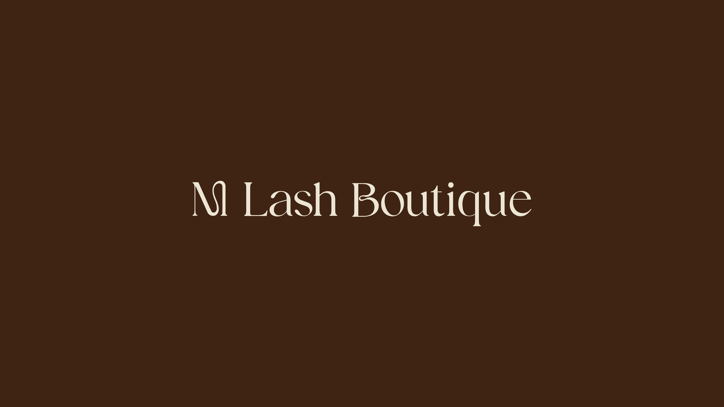
M Lash Boutique
Strategic Brand Identity
THE PROJECT
M Lash Boutique is a home lash salon on Sydney's Northern Beaches, founded by Emma, a mother building a business around real family life. The salon's first offering is lash extensions, with more services to follow, all in a warm, private setting where mothers are welcome to bring their children and appointments flex to fit the day.
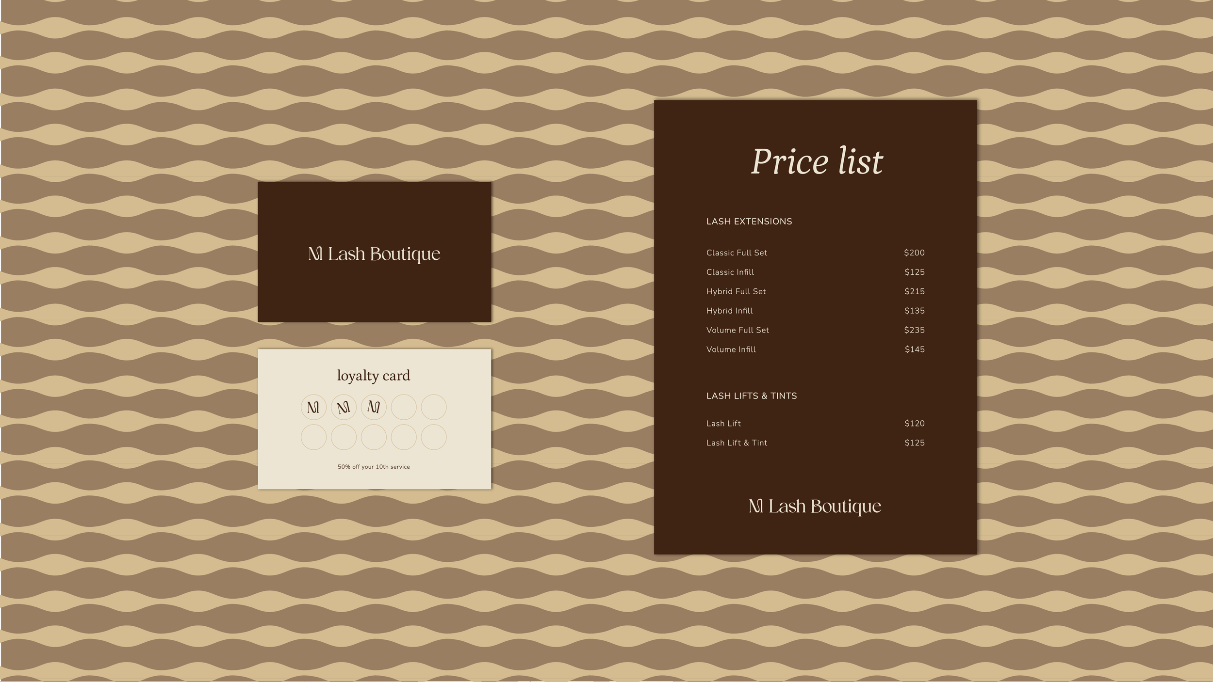
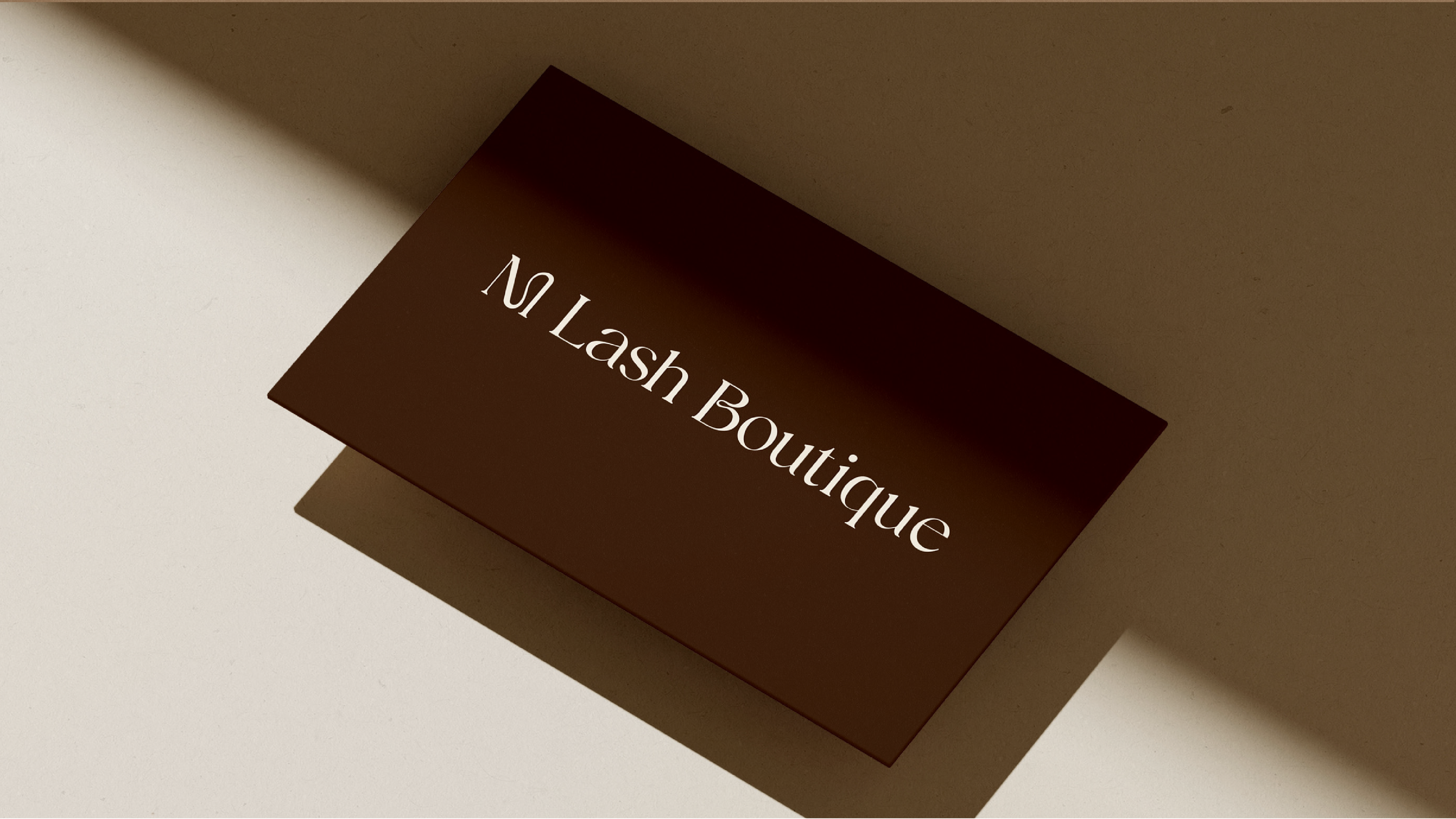
As a brand-new launch, M Lash Boutique needed an identity that captured a genuinely different offer: flexible, personal and welcoming, without slipping into the generic. Else Studio built the brand from the ground up, shaping its positioning and building a complete logo suite, a warm neutral palette, a considered type system and full brand guidelines.
VISUAL DIRECTION
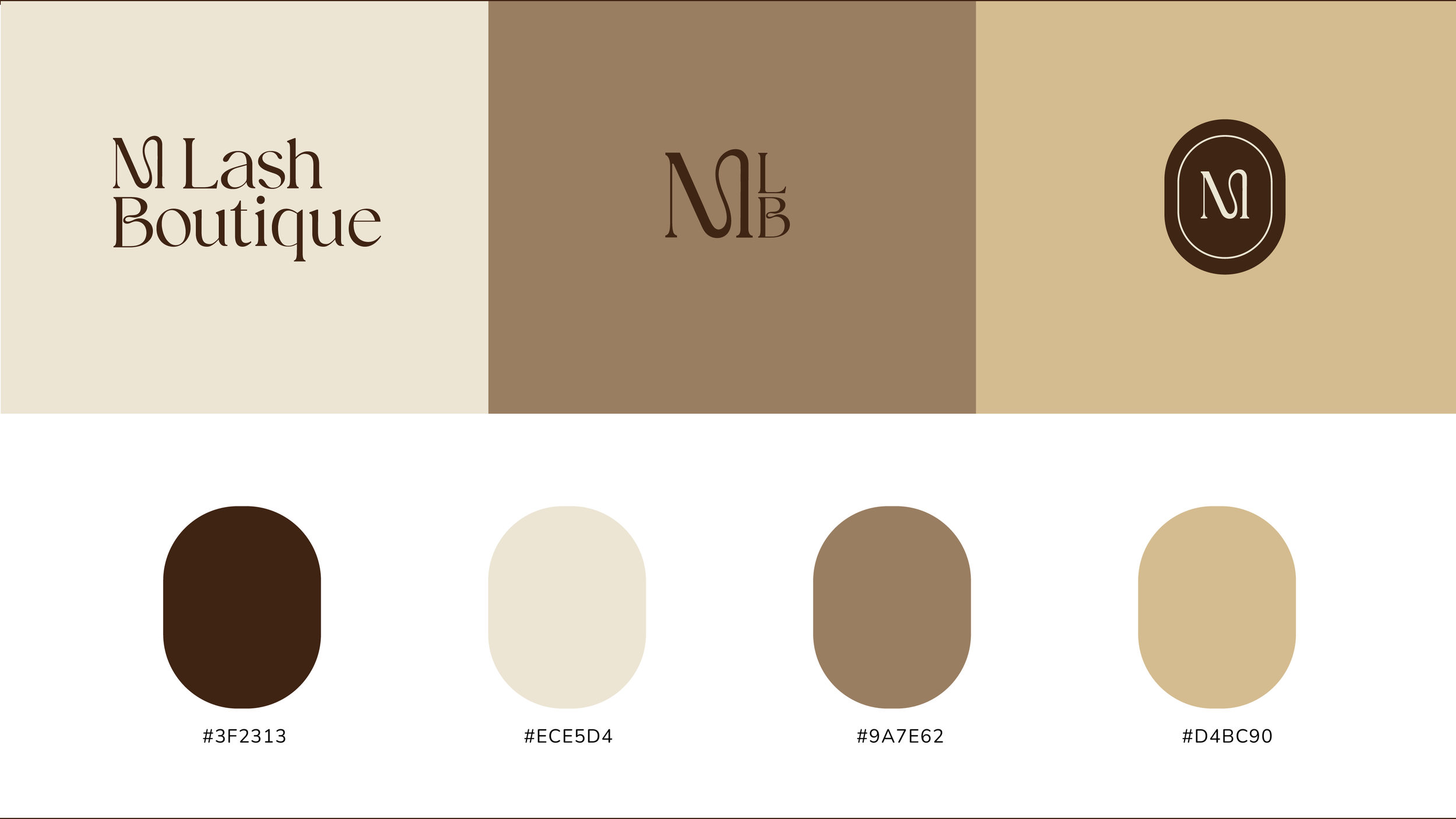
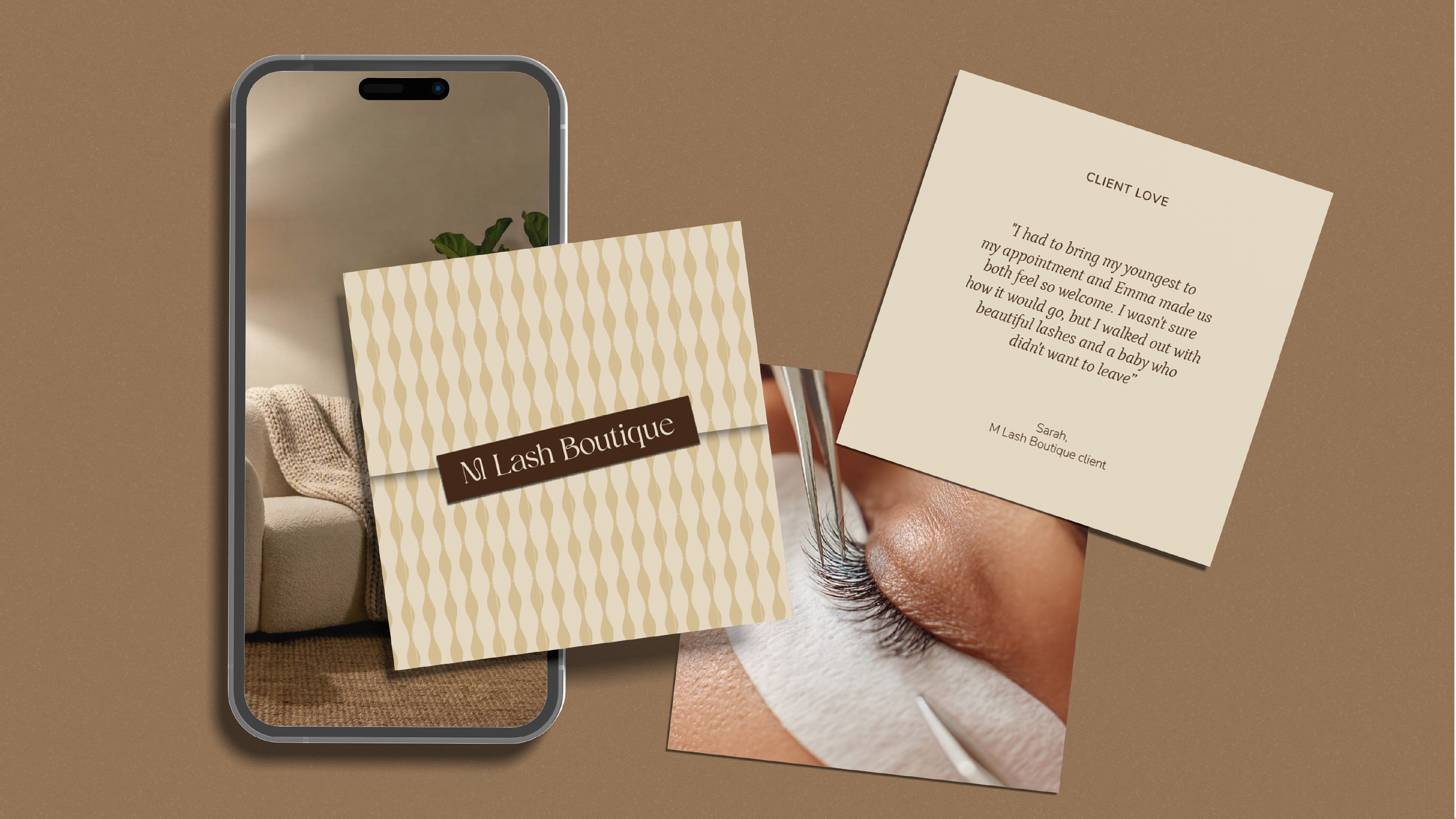
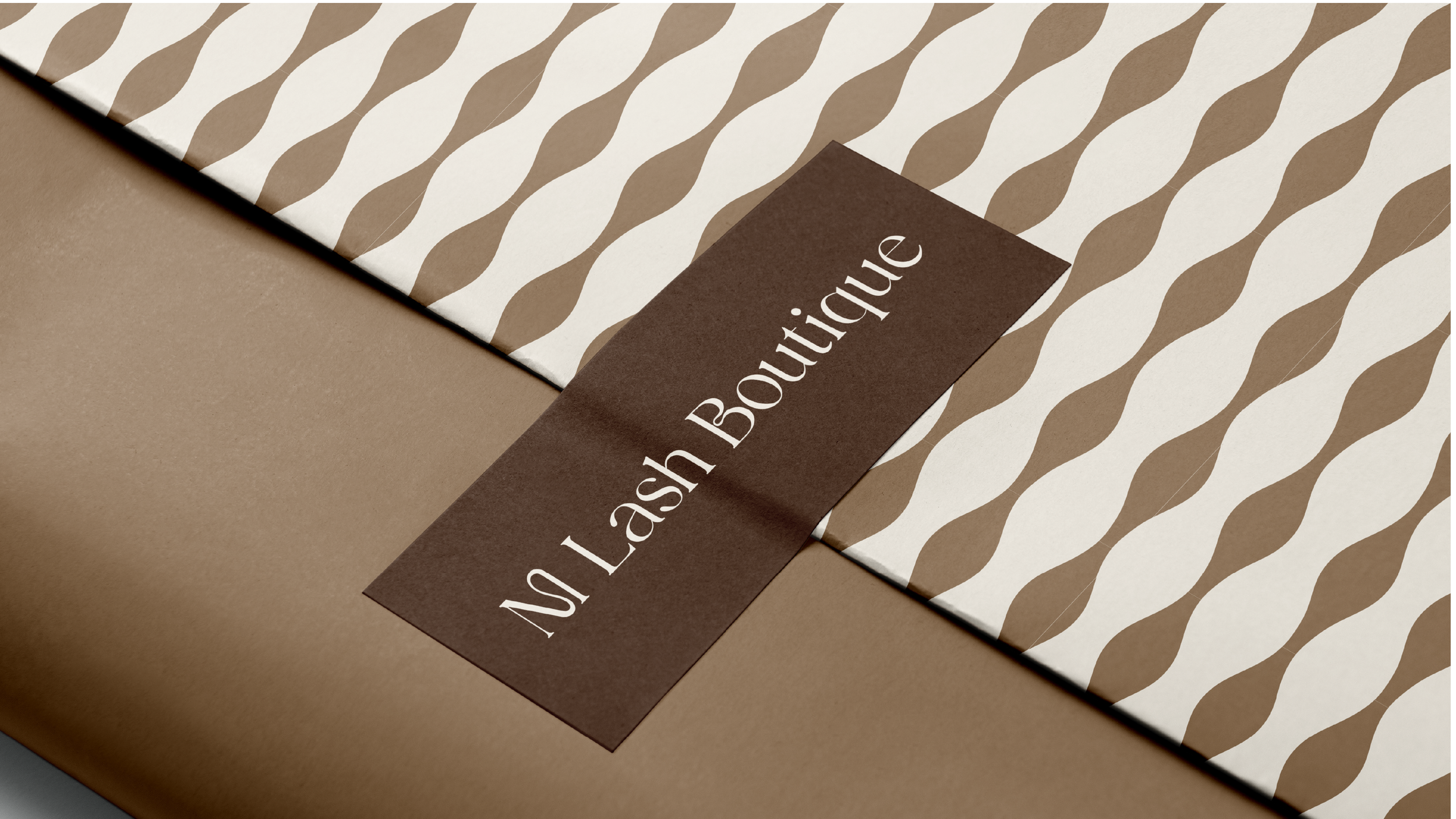
The identity is built on warmth, the same warmth Emma wants clients to feel the moment they walk in. M Lash Boutique commits to a palette of espresso, caramel, golden hour and latte. Soft cream, anchored by a rich brown, gives the brand its backbone and keeps it reading as premium rather than plain.
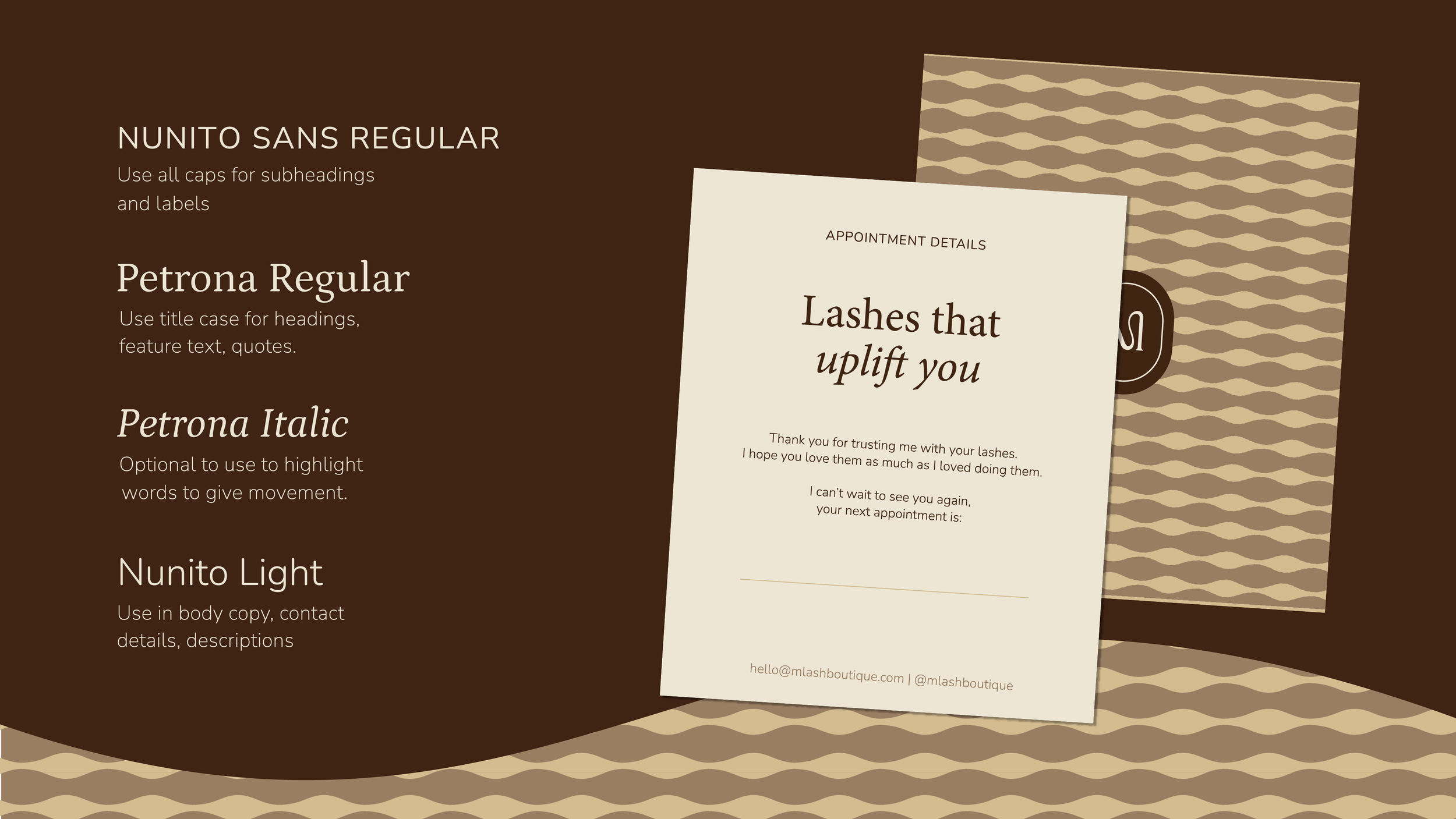
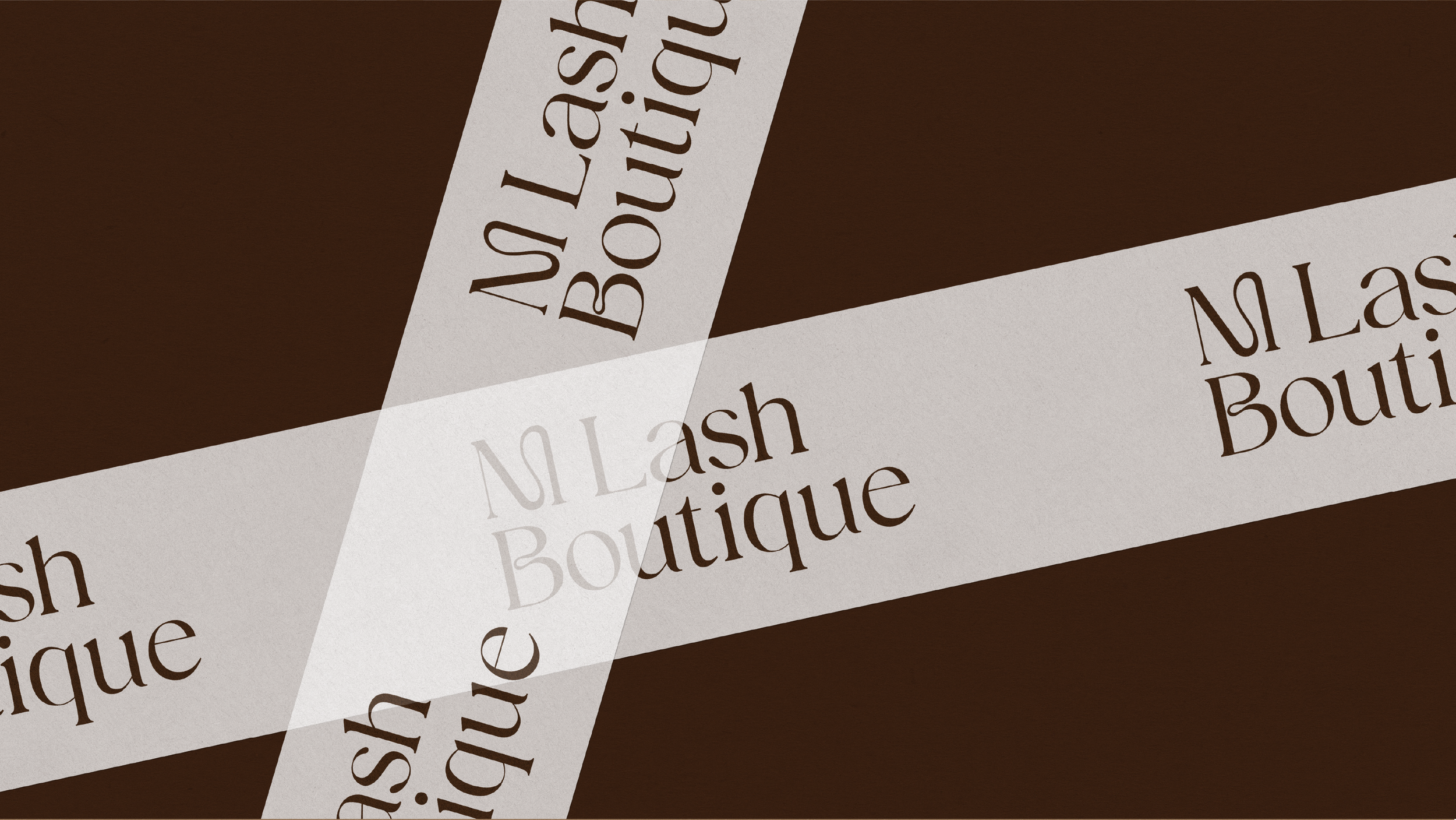
Typography pairs Petrona, a warm serif, with Nunito Sans, a clean and friendly sans, quietly steering the brand toward something more considered than the script-led look so common in the category. The customised M mirrors the natural arc of lash work, while a wavy pattern widens from wispy to full volume, echoing the range of lash sets and the curve of the eye.
Some of my fav projects
-
![The Piece retro-inspired brand identity with pink logo and tiled graphics on red grid background]()
The Piece
-
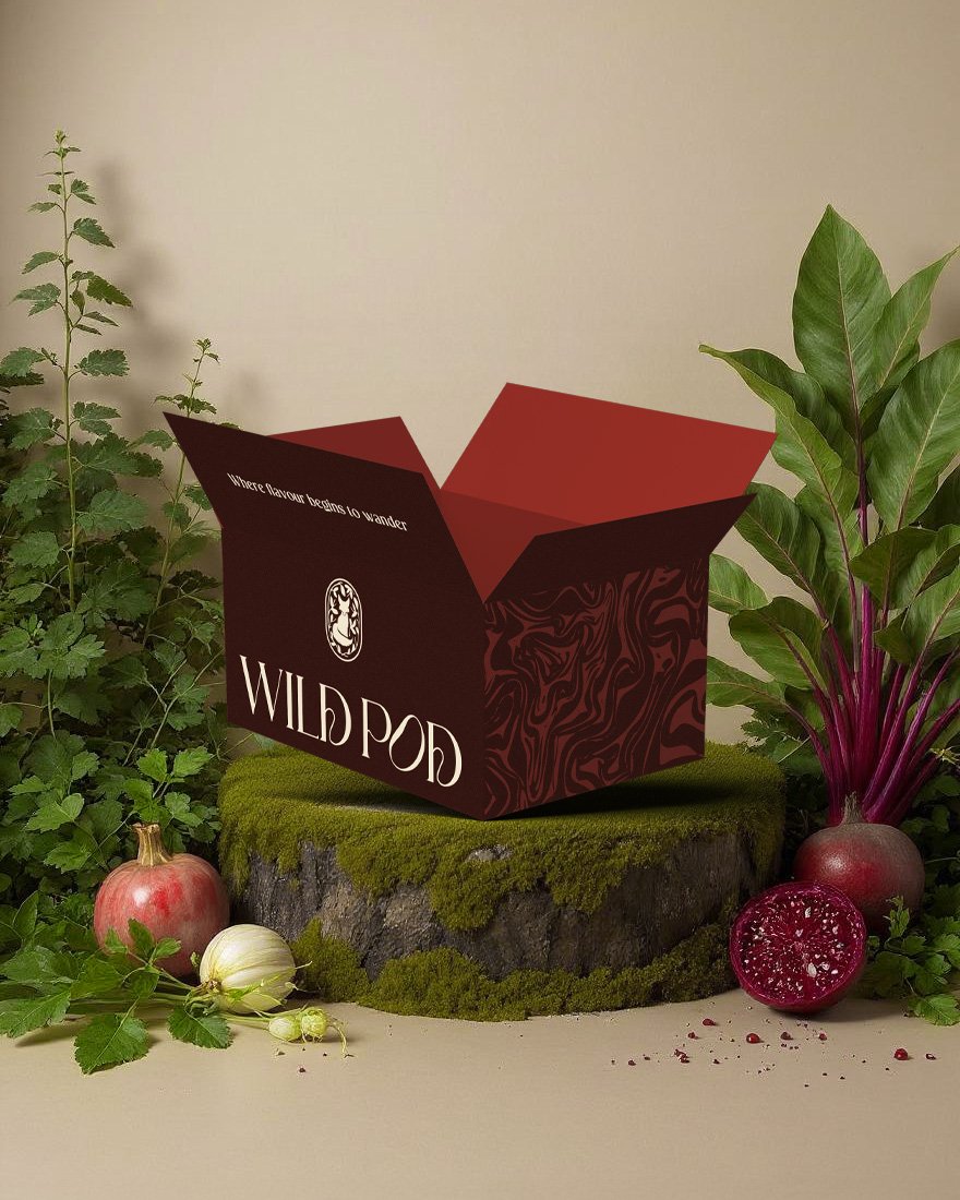
![Wild Pod packaging design with branded box surrounded by fresh vegetables and herbs]()
Wild Pod
-
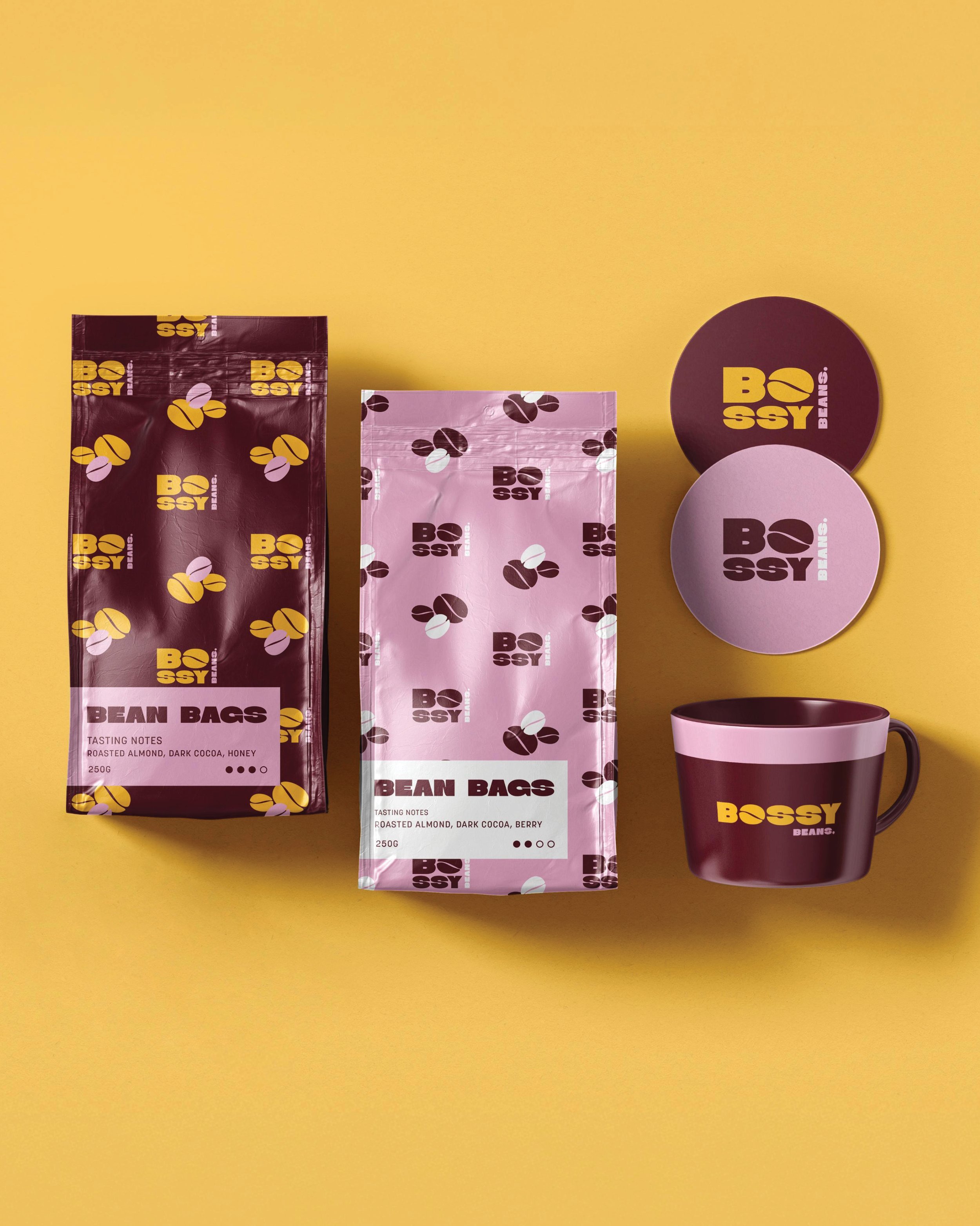
![Packaging of Bossy Beans brand coffee, including two bags of bean coffee, two round coffee coasters and a coffee mug, all set on a yellow background.]()
Bossy Beans
-
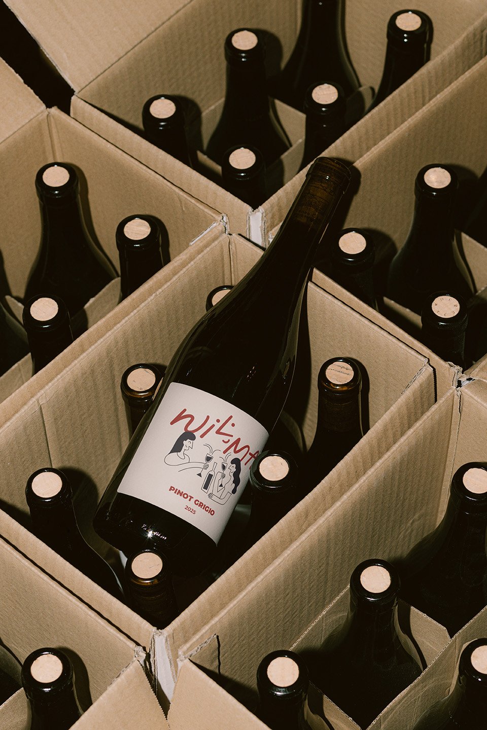
![A wine bottle labeled 'Wilma' with an illustration of two women holding wine glasses, placed in an open cardboard box among other similar bottles.]()
Wilma Wine Co
-
![The Piece retro-inspired brand identity with pink logo and tiled graphics on red grid background]()
The Piece
-
![Wild Pod packaging design with branded box surrounded by fresh vegetables and herbs]()
Wild Pod
-
![Packaging of Bossy Beans coffee, including a maroon bag with yellow and purple bean illustrations, a pink bag with dark bean illustrations, two round tins labeled Bossy Beans, and a matching mug with yellow and pink text, all set against a yellow background.]()
Bossy Beans
-
![A cardboard box containing multiple bottles of wine, with one bottle placed diagonally across the others. The bottles are dark-colored with light-colored caps, and the label on the diagonal bottle reads 'Wilamat, Pinot Grigio, 2025, featuring a cartoon illustration of two women drinking wine.]()
Wilma Wine Co