Base & build
Your foundation for the perfect brand
We’ve simplified the branding process into two clear, flexible steps - no confusing tiers, no guessing what you “should” need.
It starts with a solid brand foundation built around the essentials every brand needs to show up with confidence. From there, you can customise your package with any extras that make sense for your brand.
lets get started!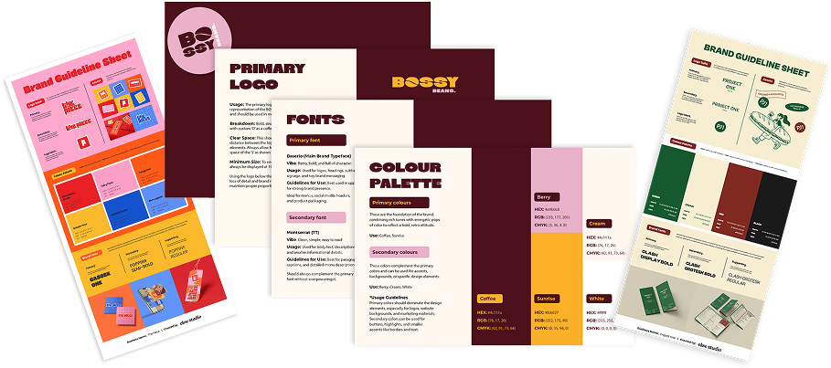
Step one
Base ingredients
A complete brand foundation, built to fit your business.
This is where every brand starts. The strategic thinking and core visual pieces that give your brand consistency and room to grow. It's the base everything else builds on, designed to work seamlessly wherever your business shows up.
It's built on more than good looks. I get to know your business, your people and what you're up against first, so your brand actually means something from day one.
No confusing tiers, no paying for boxes you'll never tick. When your brand needs more, you add it in Step Two.
-
We start by getting clear on who you are, who you're for, and what you're up against, so every design choice actually has a reason behind it.
-
Two creative directions presented in moodboards, then your favourite developed in full.
-
Your main logo plus the variations you'll really use, so you've got the right one for every spot, big or tiny.
-
A considered set of colours, codes and all, that play nicely together across print and screen.
-
A full font suite including heading, subheading and body fonts.
-
A supporting graphic, motif or simple pattern that gives your brand a little extra personality and helps it feel complete.
*Not every brand needs one. When yours does, I build it in.
-
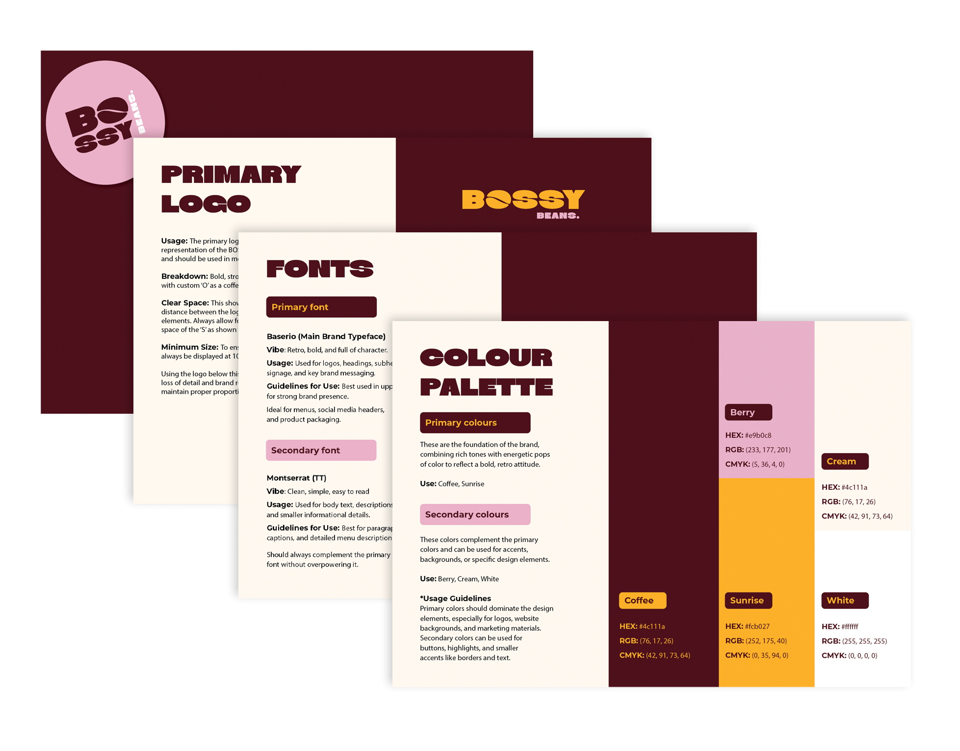
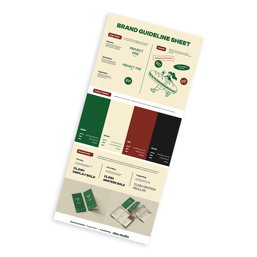
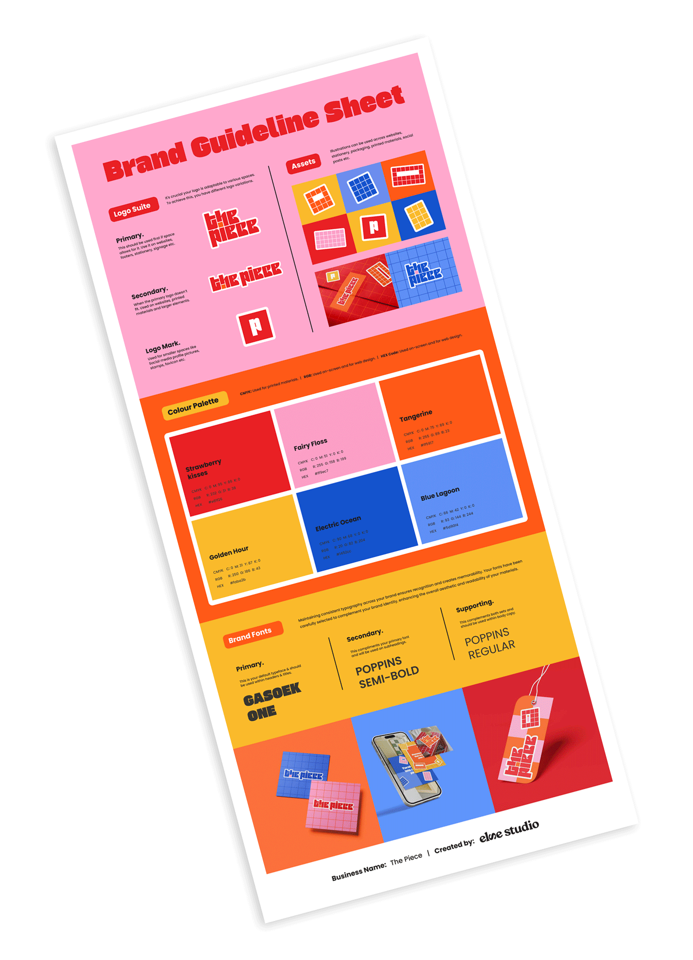
A clean, easy-to-follow guide to your new brand: your logo, colours, fonts and the key dos and don'ts, so it stays looking sharp long after I hand it over.
Step two
Build it out
Now for the fun part: making it properly yours.
Your foundation's set, so this is where we build on it. The extras that take your brand out into the real world, chosen around your business, your goals and how you actually want to show up. You add what you'll use, and skip what you won't.
-
For when your brand wants a wider visual library. Custom illustrations, icon sets, extra patterns and graphic bits that give you more to play with.
-
Everything you need to look sharp on the feed and beyond. Social templates and tiles, plus graphics for your launches, campaigns and emails.
-
Your brand out in the real world. Business cards and stationery, packaging and labels, signage and posters, all the physical touchpoints people can hold or walk past.
The process
How it works
Think of it as branding with a plan. We start by getting to know your business, move into the creative exploration, then refine your chosen direction into a brand system you'll feel confident using everywhere. Here's how it goes.
01. Discovery Questionnaire
It all starts with getting clear. You'll fill out a detailed questionnaire so I can really understand your business, your goals, your audience and where you're headed. The more honest and thoughtful your answers, the stronger your brand will be.
02. Strategy
This is where the thinking happens, and it's built into every project, not a paid extra. I unpack your positioning, your audience and what you're up against, so every creative decision has a reason behind it. For bigger or more complex brands we can go deeper here, but the strategic grounding is always there.
03. Creative Direction
I present two strategic creative directions as moodboards, both grounded in your research and strategy. You choose the one that feels right, and that's the single direction we complete and build your whole brand around. This is about getting the feel right before we design a thing, and choosing with intention, not just personal taste.
04. Logo Direction Presentation
Your logo direction is designed and presented with the thinking behind every decision: the concept, the typography, the lot. Two rounds of refinement are included here to get it just right before you approve.
05. Brand Identity Presentation
Once your logo's approved, everything else clicks into place. Your colours, typography and supporting elements are built around it into one cohesive system that feels intentional and complete. One round of refinement makes sure it's polished and properly aligned.
06. Revision Rounds
Three structured rounds keep us in sync the whole way through: two on your logo direction, then one on your full brand identity before final sign-off. These check-ins are where we refine the details, spacing, scale, colour, hierarchy, type and layout.
07. Delivery
Once approved, your final brand files are packaged and delivered in a complete handover folder, ready for you to confidently show up everywhere.
This includes your full logo suite in AI, EPS, PDF, SVG, PNG and JPG formats, RGB, CMYK and HEX colour specifications, your final typography system, a comprehensive Brand Guidelines document, and an organised asset folder for seamless implementation across print and digital.
Frequently Asked Questions
-
You'll choose from two creative directions presented as moodboards, and we bring one to life as your complete brand.
Both directions are built from your strategy and research, so you're choosing between two considered options that both genuinely fit your business, not picking a favourite on gut feel. From there we develop and refine the one you choose into a full, cohesive brand. It's a focused way to work, and it's exactly what makes the final result feel so intentional, rather than a logo plucked from a pile of options.
-
Three structured rounds, built right into the process so nothing ever feels rushed. That's two rounds on your logo direction and one on your full brand identity, giving us clear checkpoints to refine, align and make sure everything feels completely like you before sign-off.
Revisions are all about perfecting the direction we've already landed on together: spacing, scale, colour, hierarchy, type and layout. Because your brand is guided by strategy from day one, we're usually fine-tuning, not starting over.
-
No, I don’t just make logos. A logo alone is a name without a story. I create systems: colour, type, rules and simple assets so the logo works the same on websites, socials, packaging and signs.
-
You’re always welcome to share colours you’re drawn to, references you love, or even colours you know you don’t want.
That said, colour choices are ultimately guided by strategy, accessibility, and how your brand needs to show up across real-world applications. My role is to take your preferences and translate them into a palette that works cohesively, communicates the right tone, and holds up across digital and print.
Sometimes that means refining your original idea, adjusting tones for usability, or introducing supporting colours you may not have considered
-
I work with one branding client at a time. Just you and me! This means I can fully immerse myself in your project, obsess over the details, and give your brand the love and focus it truly deserves.
-
Before we begin, I’ll ask you to complete a questionnaire so I can understand your business, goals and audience.
You don’t need to have everything figured out. Just come with clarity around what you offer, who you’re speaking to, and any inspiration you love. Pinterest boards are always helpful for this.
-
Yes. A 50% deposit is required to secure your project booking.
This confirms your place in my schedule and allows work to begin. The remaining balance is due before final files are released, unless otherwise outlined in your proposal.
Deposits are non-refundable, as they cover project setup, planning, and time reserved exclusively for your project.
-
Yes - rush projects may be available depending on timing and scope.
If a project needs to be completed within a shorter timeframe than usual, a rush fee may apply. This reflects the additional time, prioritisation, and schedule adjustments required to deliver the work without compromising quality.
Rush availability and fees are always discussed and confirmed upfront before the project begins.
Some of my fav projects
-
![The Piece retro-inspired brand identity with pink logo and tiled graphics on red grid background]()
The Piece
-
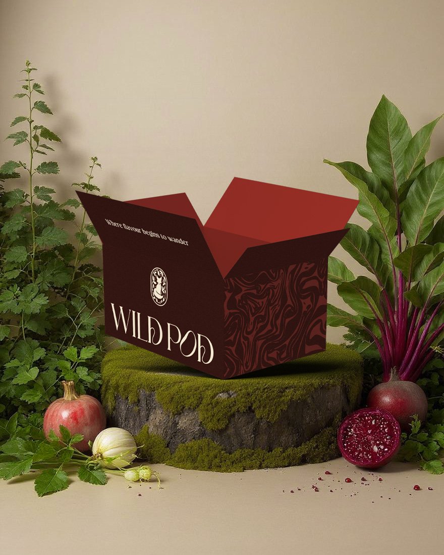
![Wild Pod packaging design with branded box surrounded by fresh vegetables and herbs]()
Wild Pod
-
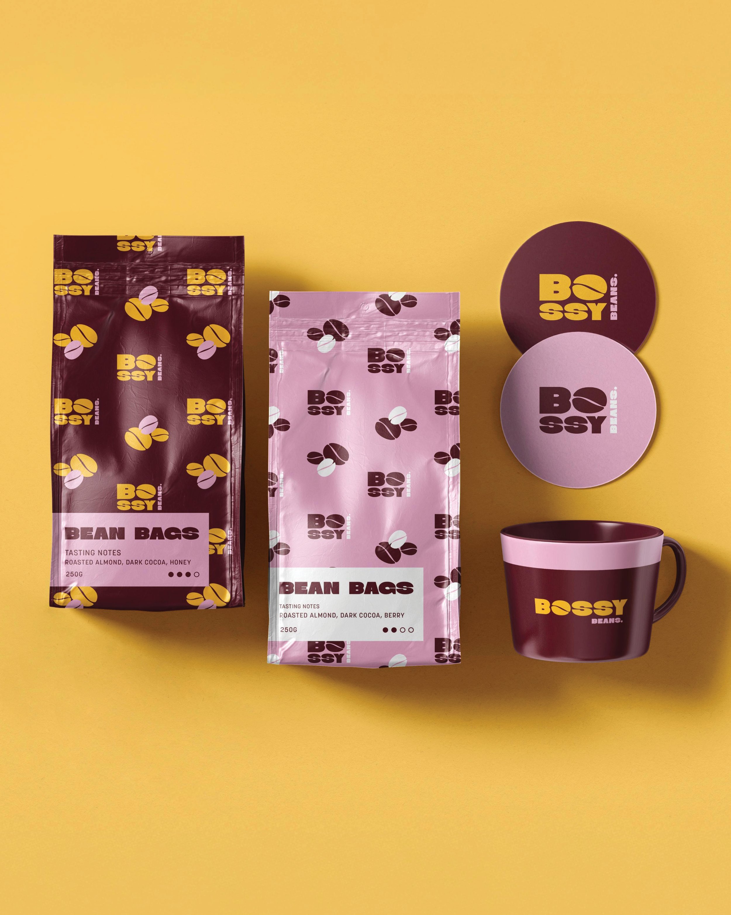
![Boxes of Bossy Bean Bags coffee with new packaging design, including a maroon and pink mug with Bossy Beans logo, set against a yellow background.]()
Bossy Beans
-
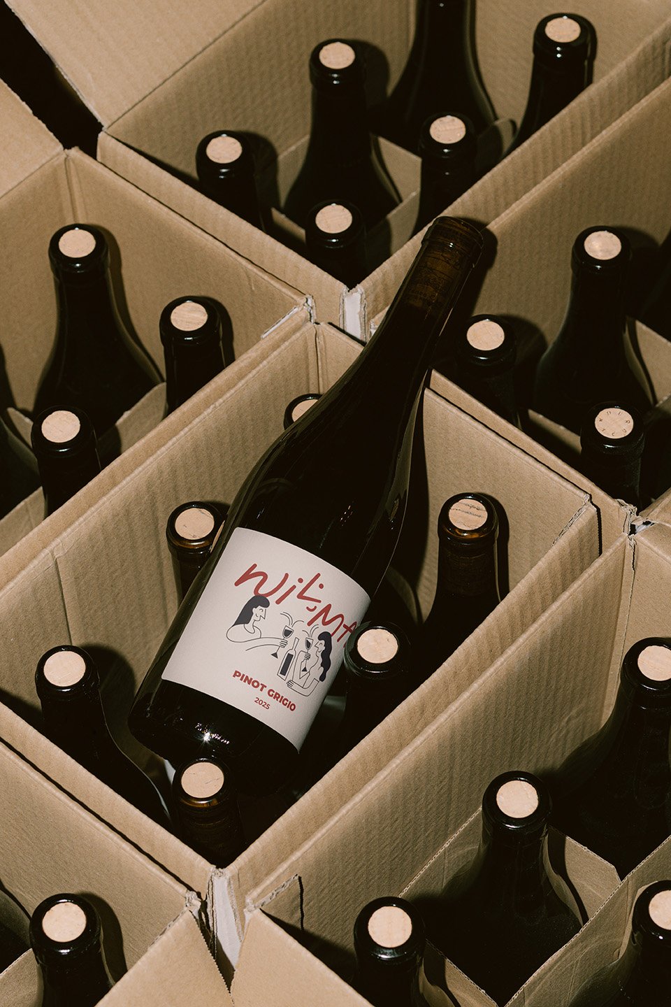
![A bottle of wine labeled "Wilma," laying on its side among several unopened wine bottles in cardboard boxes.]()
Wilma Wine Co
-
![The Piece retro-inspired brand identity with pink logo and tiled graphics on red grid background]()
The Piece
-
![Wild Pod packaging design with branded box surrounded by fresh vegetables and herbs]()
Wild Pod
-
![Packaging of Bossy Beans coffee beans, including two bags, two circular containers, and a mug, with a yellow background.]()
Bossy Beans
-
![A cardboard box containing multiple bottles of Wilson Pinot Grigio wine, with one bottle noticeably tilted.]()
Wilma Wine Co